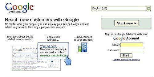
The most successful online advertising system is Google AdWords. It’s a hands-down winner having brought the company more than $50 billion in the past 12 months. That’s $1,585 EVERY SECOND…! But hang on a minute; every one of those adverts that bring in the money looks the same. Apart from the words, the design is identical. Every advert has a short headline in blue, a website address in green and a couple of lines of details in black. As an advertiser you cannot change things – this is all pre-set by Google. They are in charge of how your advert looks.

This goes completely against the traditional way of thinking about advertising. Pick up any text-book about advertising and you will see that the accepted view is that you need to be different to stand out. According to those “advertising experts”, in order to be successful in advertising you need to be striking, you need to stick your head out above the crowd and be so visible people cannot ignore you. I just wonder how many of those “advertising experts” earned $50 billion last year?
The world’s most successful advertising system thrives on everything being similar; the complete opposite of what advertising experts tell us.
Sometimes, experts can be wrong and new research on human attention suggests why. Advertising experts explain the need to be different and stand out because they argue that humans are primed to notice the unusual. That is true; as marketing guru Seth Godin pointed out in his book, Purple Cow, you’d notice one of those in a field of plain black and white Friesians.
But the new research from Princeton University points us to another factor worth considering. This study shows that we bias our attention towards environmental regularities. In other words, most of our attentional resources are looking for similarities. That makes sense, of course, otherwise we would never really be able to cope with the world around us. You need to know that at the moment what you are looking at is a computer screen, for instance. If you spent all your attention on looking at the differences in the screen, you would find it hard to cope with reading websites.
Of course, if this page were to have some kind of whizzy, flashing item – you would notice it; you’d probably be annoyed, but you would notice it. That’s because it sticks out – the purple cow effect.
However, given that attention spans online are reducing dramatically and that nowadays people spend fractions of seconds looking at pages, it means that the bulk of their time is spent noticing similarities. There simply is less available attention time to notice different things. That is borne out by the appallingly low levels of engagement with display advertising on the web. Agencies spend hours and hours trying to create that difference that will be noticed in a square box 125 pixels square.
Meantime, Google rakes in the money by focusing on everything being the same. That allows our low attentional span to notice their adverts, while we ignore almost everyone else’s.

