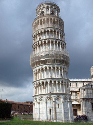
 So, here’s a conundrum: which way does the Leaning Tower of Pisa lean? Does it lean to the left, or to the right? It rather depends, of course, which way you are looking at it. But the chances are, if you look at the Tower and it appears to be leaning to the left you will judge it to be shorter than if you are facing the tower and it is leaning to the right. Psychological studies have shown that we tend to judge things on the left to be smaller than equivalent things on the right.
In an interesting recent study, psychologists also looked at the way people leaned their bodies. If they leaned to the left the answers they gave to questions were lower than the same questions given to people leaning to the right. Example questions included “how many number one hits did Michael Jackson have?”. When people were leaning to the left they suggested fewer number one hits than people who leaned to the right.
Quite why this phenomenon occurs is unexplained, but the left bias towards things being lower or smaller is a recognised feature of our behaviour. When things are on the left we reckon they are smaller.
Which begs the question – which is the best side of a web page to publish your prices? You guessed it, put your prices on the left, not the right. By doing so, people will perceive your prices to be low. Put them on the right and the same price could seem higher.
This may well mean that if your prices are in your text, you need to adjust your content so that the price is not at the right hand end of a line, but drops down so it is on the left of the next line.
And if you run single-page sales websites, where prices are frequently placed in the middle, then buck the trend and put your price on the left – you could well see your sales rise as people perceive your prices to be lower.
Look at the price stickers on books – often on the left of the jacket. That’s probably not a coincidence. Many retailers also display prices below each item, to the left hand side. It might be coincidence or it might be years of experience which show that the position of the price ticket influences total sales.
If you have a choice of where to display your prices on your website, put them on the left. It won’t do you any harm and could well do you some good.


Wow. I'm surprised. I would never have thought which side the price was would make a difference. Something else to A/B test for.
I have seen a difference on survey ratings. People were asked to rate from 1->10 (left to right) on one survey and another it was 10->1. Each survey had about 5000 responses and the difference was ~1.0. Not a true scientific test as there were other differences. but seems like difference was significant.