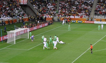
Fact. Football referees are biased. Those players in the World Cup who cry “foul” when the referee finds against them could well be right, according to a new study of the unconscious effect of direction of motion. The research has found a statistically significant difference in the accuracy of spotting a foul depending upon the direction in which the ball is being played. If the ball is travelling from left to right, the referees are much more accurate than when the ball is going from right to left (from the perspective of the referee’s position on the pitch). It seems that video technology would not only help in deciding whether a goal has been scored, but would also determine if a true foul had taken place. Referees are not as good as they might like to think they are…!
The study tells us more than referees have an inbuilt bias – perhaps you already thought that anyway…! It also emphasises the importance of direction in our analysis of a visual situation. The study shows that for people who read from left to right, anything that travels from right to left is perceived less accurately. For countries where the reading is right to left, the reverse is the case.
Recently I showed how WordPress has design wrong from a memory point of view. The preponderance of right-biased menu options makes it less easy for people to remember what is on your website. Now, this new study on the bias of motion in football matches, adds weight to the argument. The football study confirms there is a bias in left to right writing for our brains to consider anything that goes right to left as “not quite right”.
This clearly has implications for your website design. It is not just about where you put navigation, but about the flow of the page. If things flow from left to right, your visitors are much more likely to find it “normal” – assuming your readers are all from countries where left to right writing dominates. For example, do your pictures have a left to right flow in them, or are the “pointing” the wrong way. Newspaper and magazine designers often use facial images with direction in them to move your focus around the page; but they work best if they go left to right – not “against the grain”. The flow in the photo on this page is, for instance, the wrong way (deliberately to make the point..!). It is going right to left. Traditional designers would say that’s good as it draws your eye to the text to make you read it. But this new research on directional bias would imply that it makes you think there’s something not quite right.
What this all means is that subtle design elements on your web page could have consequences for the “stickiness” of your pages and the engagement which people have with your material. Much website design these days has a right to left bias. Maybe that’s why engagement is not as good as people might like it to be. Left to right may look “boring” but it sure appears to help psychologically.
If you don’t want you readers to cry “foul”, you might need to reconsider the directional bias of your website.

1 thought on “Biased football referees prove value of website redesign”
As what Google is saying Content is the king of all page rank improving. That is why Article writers are so good in the internet.
Comments are closed.