 By John Cassidy
An image is a powerful tool and a great one can really make a website. Just as an eye-catching photograph in a newspaper or magazine entices you to stop and read more, professional images on your website will immediately demonstrate to your clients that you are serious about your business. Whether it’s your personal profile portrait or photos of your product range, professionally taken images will stand head and shoulders above all else.
The old adage says “a picture paints a thousand words”, so here’s a brief guide to ensure your images are saying the right thousand words about your business.
Profile images
Overall, profile images should be warm and engaging. Something that brings out your personality and character and reflects your brand image. Remember, people buy people and if you look relaxed and approachable in your portraits people are more likely to connect you.
The first thing people look at in a portrait is the eyes. therefore it is important that they are clear, bright and sharply in focus. You can read a lot from people’s eyes and a good portrait photographer knows this. They will also know the techniques to use so you get the right pictures to go with your brand image. Whether that’s confidence, trust, assurance, approachable, a good listener, professional, friendly, relaxed or a combination of these.
If you are worried about how you may look there are hundreds of little tricks your photographer has up their sleeve which can be used. For example looking slightly up towards the camera will hide those double chins and lighting the thinner side of the face can make your face look slightly slimmer.
Above all your profile photo should look like you. You don’t want potential clients to walk right past you because they didn’t recognise you from your profile image.
Particular attention should be also be paid to colour and style of clothing, pose, background, composition, choice of lenses, studio or location shoot and lighting. Women should be lit with soft, even lighting that flatters the complexion. Men can get away with something a bit more directional, even slightly moody. Careful lighting and posing can also help to hide or disguise features that you may be uncomfortable with.
Group shots need even more thought. A line up of people against a wall is hardly inspiring. Ideally they should doing something, but nothing too staged or posed. Again the right photographer will know how to photograph to make this look natural. If you run a people based business then why not show your staff happy and enjoying their work. Closer-up shots of them laughing and enjoying what they’re doing says even more about your brand message. It says we care.
Product or Pack shots
If you sell products, then it is important that your images are clear and show the product at its best, particularly as people can‘t feel or handle it before buying. This is where good lighting really counts to show the texture and feel of the product. You should also include close up detailed shots of any particular area that the buyer would be interested in. This can also be done by using selective focusing. Some sort of scale is also good, particularly if its an unusual or unknown product.
Copyright
A quick note on copyright. All images are protected by copyright (i.e. ownership by the photographer/creator) just like CD recordings and television programmes. This means that you can’t just hunt around the web and find an image you like and use it on your website. This is theft and is a serious issue. Some people opt for royalty free stock photography which is widely available on the web. The downside is that these images can be overused. You’ve probably noticed the same images cropping up on different websites.
In order to stand out you really need to consider commissioning your own professionally shot images. You can use these images as part of your press, pr and marketing material too thus making the cost of commissioning a professional photographer fairly good value
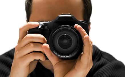
Do think seriously when considering using photography on your website. It may seem an easy option to “do it yourself” but there’s far more to getting a great image than pointing your digital camera and pressing the shutter release button.
© John Cassidy Photography 2009
Web: www.johncassidyphotography.com
Email:
Tel: 01344 489704
Mob: 07768 401009

